
June 26, 2024
Tips for Choosing the Best Mobile App Developer in Vadodara
A Complete Guide to Hiring the Best Mobile App Developer in Vadodara In today’s digital…
Adopt Mobile-Responsive Design to Ensure Your Website Looks and Functions Seamlessly on All Devices. with A Responsive Layout, Your Site Adapts to Various Screen Sizes, Providing an Optimal Viewing Experience for Visitors on Smartphones, Tablets, and Desktops. Beyond Improving User Satisfaction, Mobile Responsiveness Is Also Crucial for SEO, as Google Prioritizes Mobile-Friendly Sites in Search Results. by Embracing Mobile-Responsive Design, You Enhance Usability, Increase Engagement, and Bolster Your Online Presence Effectively.
A Complete Guide to Hiring the Best Mobile App Developer in Vadodara In today’s digital…

In today’s digital age, having a well-designed and functional mobile app is essential for businesses…

Top Trends in Mobile App Development for 2024 In the rapidly evolving world of technology,…
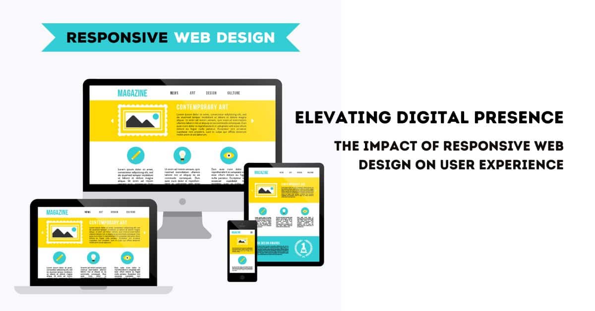
Elevating Digital Presence: The Impact of Responsive Web Design on User Experience In the ever-evolving…

Trends Shaping the Future of Mobile App Development The mobile app development industry has witnessed…

Mobile applications have become increasingly important for businesses in the digital age. In today’s digital…

WordPress is the most well known CMS (content management system) on the web today. While…